Plotting Graphcs and Heatmpas
Graphs
It may be necessary to install first
install.packages("igraphdata", repos = "http://cran.r-project.org")
library(igraph)
library(igraphdata)
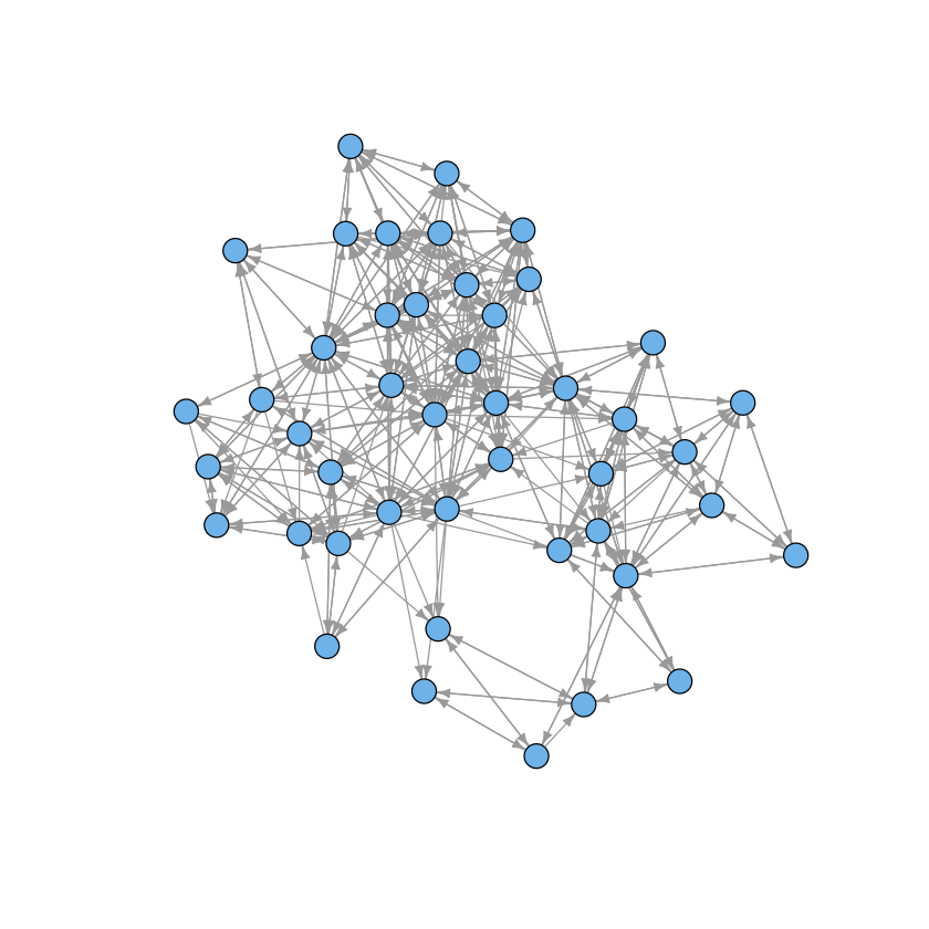
data(macaque)
plot(macaque, layout=layout.auto, vertex.shape="circle",
     vertex.size=8, edge.arrow.size=0.5, vertex.label=NA)
Fancy heatmaps
Also see d3heatmaps if you want an interactive heatmap. This does not seem to work within the notebook but will work in RStudio or an R script.
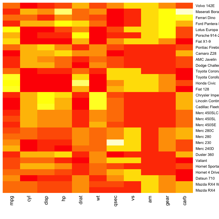
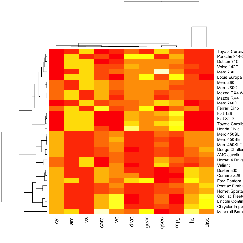
library(pheatmap)
pheatmap(as.matrix(mtcars), scale = "column")

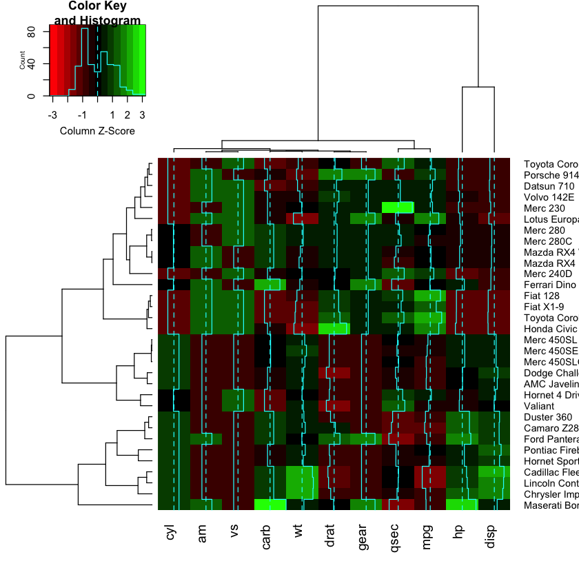
library(gplots)
heatmap.2(as.matrix(mtcars), scale = "column", col=redgreen)
Work!
Here we will try to replicate the noise discovery heatmap shown in the statistics class.
suppressMessages(library(genefilter))
Perform noise discovery
set.seed(123)

n <- 20 # number of subjects
m <- 20000 # number of genes
alpha <- 0.005 # significance level

# create a matrix of gene expression values with m rows and 2*n columns
M <- matrix(rnorm(2*n*m), m, 2*n)

# give row and column names
rownames(M) <- paste("G", 1:m, sep="")
colnames(M) <- paste("id", 1:(2*n), sep="")

# assign subjects inot equal sized groups
grp <- factor(rep(0:1, c(n, n)))

# calculate p-value using t-test for mean experession value of each gene
pvals <- rowttests(M, grp)$p.value

# extract the genes which meet the specified significance level
hits <- M[pvals < alpha,]
- Use pheatmap to plot a heatmap
- Remove the row names (Google or use R’s built-in help to figure out to do this)
- Use this color palette to map expression values to a red-blakc-green scale
colorRampPalette(c("red3", "black", "green3"))(50)