Practice 4
library(ggplot2)
library(reshape2)
library(pheatmap)
library(genefilter) # for rowttests
library(nlme)
data(Rail)
Attaching package: ‘genefilter’

The following object is masked from ‘package:base’:

    anyNA
Exericse 0
Using base graphics, make a 2 x 2 grid for plotting.
Top left - Generate 100 random numbers from a t-distribution with 5
degrees of freedom - Plot a normalized histogram (i.e. area sums to 1)
with 8 breaks - Overlay a smoothed density estimate (using density)
in orange - Overlay the true density estimate (using dt) in red -
Add a rug
Tor right - Using the iris data set, make a scatter plot of Sepal
length agaisnt Sepal width. Color the points by Species. - Add your own
title and x and y lables
Bottom left - Generate 100 numbers from a Poisson distribution with rate = 3 - Plot a bar chart showing the counts for each value
Bottom right - Make a box and whiskers plot of the 4 numeric variables
in the iris data set - Show vertical labels for all Species names -
Adjust the margins so that the labels are visible using the mar
(bottom, left, top, right) parameter. You can see the default values
with par()$mar. Remember to restore the orignal parameters at the
end.
Save the plot as a Portable Neetwork Graphics (png) file.
png("myplot.png")
par(mfrow=c(2,2))
x <- rt(100, df=5)
hist(x, breaks = 8, probability = TRUE)
lines(density(x), col="orange")
xp <- seq(min(x), max(x), length.out = 50)
lines(xp, dt(xp, df=5), col="red")
rug(x)
plot(iris$Sepal.Width, iris$Sepal.Length, col=iris$Species,
     main="Scatter by Iris species", ylab="Length", xlab="Width")
n <- rpois(100, lambda = 3)
barplot(table(n))
orig <- par(no.readonly=TRUE)
par(mar=c(6.1,4.1,4.1,2.1))
boxplot(iris[,1:4], las=2)
par(orig)
dev.off()
head(Rail)
| Rail | travel | |
|---|---|---|
| 1 | 1 | 55 |
| 2 | 1 | 53 |
| 3 | 1 | 54 |
| 4 | 2 | 26 |
| 5 | 2 | 37 |
| 6 | 2 | 32 |
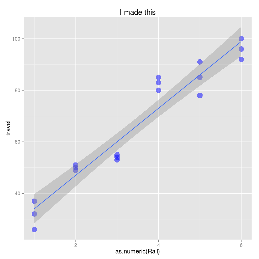
Exercise 1
- Use the ggplot function
- Create a scatter plot with Rail on the x-axis and travel on the y-axis.
- CHange the title to “I made this!”
- Change the y-axis label to be “Zero-force travel time (nano-seconds)”
- Change the size of the points to 5
- Change the color of potins to blue and transparency to 0.5
- Add a simple linear regression line to the plot with 90% confidence intervals
ggplot(Rail, aes(x=as.numeric(Rail), y=travel)) +
geom_point(size=5, color="blue", alpha=0.5) +
geom_smooth(method="lm") +
labs(title="I made this", ylab="Zero-force travel time (nano-seconds)")
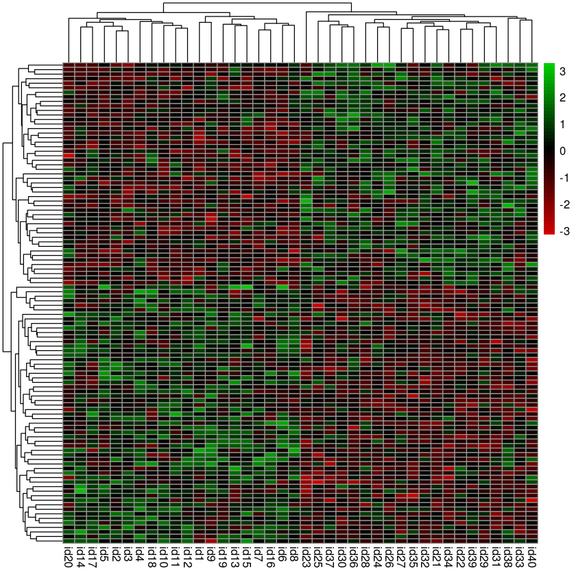
Exercise 2
Here we will try to replicate the noise discovery heatmaps shown in the statistics class.
set.seed(123)

n <- 20 # number of subjects
m <- 20000 # number of genes
alpha <- 0.005 # significance level

# create a matrix of gene expression values with m rows and 2*n columns
M <- matrix(rnorm(2*n*m), m, 2*n)

# give row and column names
rownames(M) <- paste("G", 1:m, sep="")
colnames(M) <- paste("id", 1:(2*n), sep="")

# assign subjects inot equal sized groups
grp <- factor(rep(0:1, c(n, n)))

# calculate p-value using t-test for mean experession value of each gene
pvals <- rowttests(M, grp)$p.value

# extract the genes which meet the specified significance level
hits <- M[pvals < alpha,]
- Use pheatmap to plot a heatmap
- Remove the row names (Use tAB or R’s built-in help to figure out to do this)
- Use this color palette to map expression values to a red-blakc-green
scale
colorRampPalette(c("red3", "black", "green3"))(50)
pheatmap(hits, show_rownames = FALSE, color = colorRampPalette(c("red3", "black", "green3"))(50))
a1 <- 1
a2 <- 2
sigma1 <- 25
sigma2 <- 25

subject <- paste("PID", rep(1:2, each=5))
dose <- rep(seq(10, 100, 20), 2)
geneA <- a1 * dose + rnorm(length(dose), sd=sigma1)
geneB <- a2 * dose + rnorm(length(dose), sd=sigma2)

df <- data.frame(subject=subject, dose=dose, geneA=geneA, geneB=geneB)
df
| subject | dose | geneA | geneB | |
|---|---|---|---|---|
| 1 | PID 1 | 10 | -3.367338 | -31.18716 |
| 2 | PID 1 | 30 | 54.03613 | 91.78636 |
| 3 | PID 1 | 50 | 22.40099 | 124.477 |
| 4 | PID 1 | 70 | 73.61274 | 111.6039 |
| 5 | PID 1 | 90 | 84.05749 | 188.5058 |
| 6 | PID 2 | 10 | -13.63179 | 12.04911 |
| 7 | PID 2 | 30 | 40.03472 | 57.40407 |
| 8 | PID 2 | 50 | 64.98747 | 79.04738 |
| 9 | PID 2 | 70 | 91.22307 | 147.4357 |
| 10 | PID 2 | 90 | 70.94818 | 166.8696 |
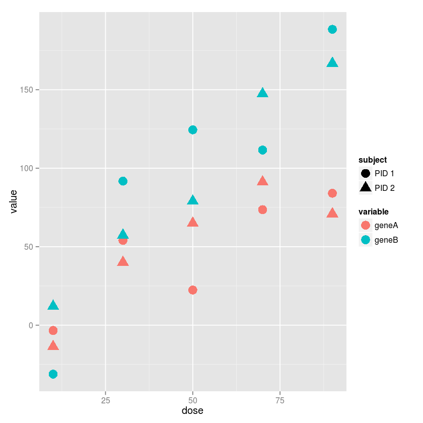
Exercise 3
Using ggplot2, plot gene expression agaisnt does, using differnt
colors for differetn genes and differnet shapes for different subjects.
(Hint: The reshape2 library may come in useful)
md <- melt(df, id=c("subject", "dose"))
md
| subject | dose | variable | value | |
|---|---|---|---|---|
| 1 | PID 1 | 10 | geneA | -3.367338 |
| 2 | PID 1 | 30 | geneA | 54.03613 |
| 3 | PID 1 | 50 | geneA | 22.40099 |
| 4 | PID 1 | 70 | geneA | 73.61274 |
| 5 | PID 1 | 90 | geneA | 84.05749 |
| 6 | PID 2 | 10 | geneA | -13.63179 |
| 7 | PID 2 | 30 | geneA | 40.03472 |
| 8 | PID 2 | 50 | geneA | 64.98747 |
| 9 | PID 2 | 70 | geneA | 91.22307 |
| 10 | PID 2 | 90 | geneA | 70.94818 |
| 11 | PID 1 | 10 | geneB | -31.18716 |
| 12 | PID 1 | 30 | geneB | 91.78636 |
| 13 | PID 1 | 50 | geneB | 124.477 |
| 14 | PID 1 | 70 | geneB | 111.6039 |
| 15 | PID 1 | 90 | geneB | 188.5058 |
| 16 | PID 2 | 10 | geneB | 12.04911 |
| 17 | PID 2 | 30 | geneB | 57.40407 |
| 18 | PID 2 | 50 | geneB | 79.04738 |
| 19 | PID 2 | 70 | geneB | 147.4357 |
| 20 | PID 2 | 90 | geneB | 166.8696 |
ggplot(md, aes(x=dose, y=value, color=variable, shape=subject)) +
geom_point(size=5)
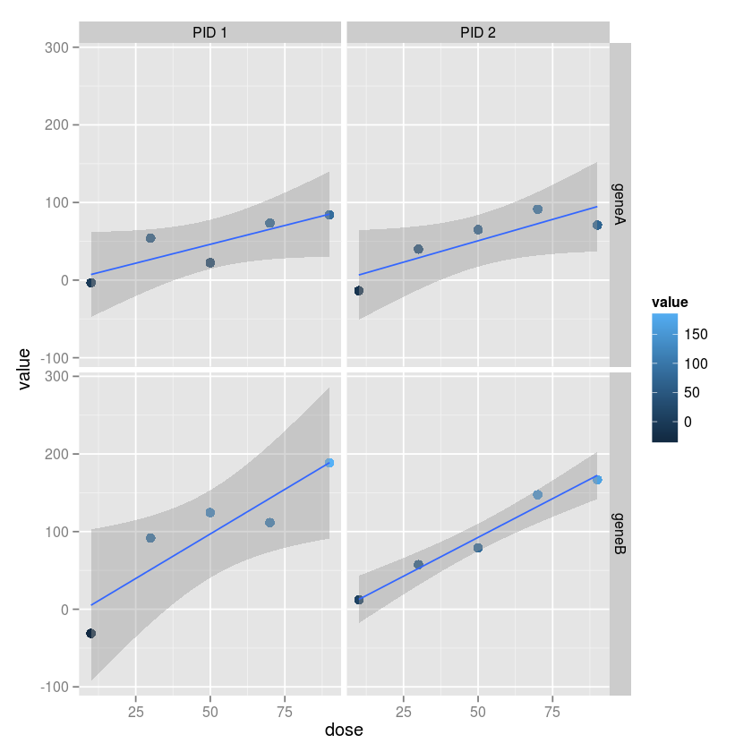
Exercise 4
Usign ggplot2, make a grid of plots with separae colummsn for each
subject and separate rows for each gene. Vary the color and size by the
gene expression value. Add a linear regression fit with 95% confidence
intervals to each plot.
ggplot(md, aes(x=dose, y=value, color=value)) +
geom_point(size=3) +
geom_smooth(method="lm") +
facet_grid(variable ~ subject)